This is one of the first photos I took on the second photo shoot. I like this photo of El a lot because she is showing that she has attitude as she is not smiling and the way that she is sitting gives off the impression that she doesn’t care, maybe how a typical teenager would act. I think that this would go well on the double page spread as it would relate well to the story that I intend on doing. The lighting is perfect in this image because the lighting enhances her face and makes her stand out more. This was the kind of thing that I was looking for because it suited the artist that she was trying to be.
In some aspects I like this photo because of the costume and the props however I don’t think it is really suitable for a rock magazine because there is flowery wallpaper in the background. This doesn’t really match with the theme ‘rock’ as it clashes because flowers are associated with different fashions and are considered to be girly. I don’t really think that the composition of this photograph is very good because her feet are cut off.
For me this has got to be one of the best photos and will probably be used for the main cover image. The quality of the photo is very good and I think the pose is more suitable as the main image. El’s expression is very powerful a he eyes are looking straight out, connecting with the target audience, inviting them in. the guitar is giving the reader a sign of the musical focus of the magazine. The only thing I have a problem with about this photo is the shadowing but with the magnetic lasso tool and cropping tool I will be able to remove this and place Eloise onto a different background relating it more to rock themed.
This photo was taken in my dad car. I love the angle of the photo as the camera is at a slight tilt giving a disorientated feel. I think her expression is serious and the image looks quite sinister. I think that this would be good to use as an extra image on the double page spread as it shows what she can afford with the money she has got since becoming a rock sensation.
I love this photo because again the lighting is perfect. I love the way the light reflects off of the silver covering and the cd’s. I thought this prop would be appropriate because it relates to her new album coming out. I think this image would be suitable for the contents page as a smaller image because it is the wrong positioning to be used on the double page spread or on the front cover. I also like the fact that the camera is slightly above the subject instead of the same height as I think this gives the photo more effect.
I didn’t like the way this photo came out because the lighting was very poor. In the background you can see the shadows of el and her hand and money. I don’t think that this photograph is very striking to appear in a magazine because there is a lot wrong with it. I also don’t like the way she is smiling because her image is meant to show attitude as if she knows best. This is not the typical image you would normally see in a rock magazine.
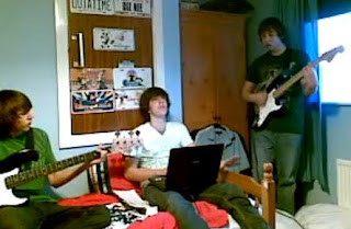
This photo has been taken in a boy's bedroom. I like this photo because it is showing behind the scenes of a band, it shows inside information of them practising as they dont have an appropriate room to do so. I think that this would be good to go on the front page because it would be suitable for the coverline. However, this photo was not very good quality but as it will be small it shouldn't notice.
This is another image that i had taken of a boy band that I made up. With this photo, i have challenged the conventions of a rock/indie magazine becasue they are not dressed in the particular style of a rocker, for example, leather jackets, printed tees, etc. I think that, challenging the conventions could be a risk especially if this image is to appear on the front page as a cover line of my magazine. However, it could start a new phase. I like this photo becasue of the different poses the boys are making, they look very natural. The clothing they are wearing contrasts with the brick wall because you wouldn't normally see smartly dressed people standing infront of a brick wall.


No comments:
Post a Comment